Candyhorn: A Playful Display Font for Warm, Human-Centered Web Design
Two weeks ago, I was finalizing the hero section of a new coaching website — one built around kindness, creative confidence, and gentle growth. The client’s voice is warm, intuitive, and intentionally unhurried. So when I dropped Candyhorn into the headline placeholder, something clicked immediately. Not because it looked “cute,” but because its organic curves and uneven baseline felt like a breath of air amid the rigid geometry of most modern UIs.
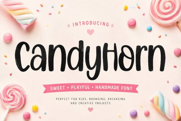
Candyhorn is a handmade display font — not a script, not a serif, not a geometric sans. It’s its own thing: sweet without saccharine, playful without childishness, and carefully crafted with subtle irregularities that echo real handwriting. Letters tilt just enough, terminals swell gently, and spacing breathes like a thoughtful pause in conversation. That warmth translates directly to how users perceive tone — especially on first load.
I tested it across three key areas: the hero banner (over a soft-focus photo), a short testimonial quote block, and a secondary CTA button labeled “Start Your Journey.” On desktop, Candyhorn shines at 48–64px for headlines — its generous x-height and open counters keep legibility strong even with minimal contrast. On mobile? I scaled it down to 36px with tighter tracking and added 2px letter-spacing. It held up beautifully — no squinting, no misreading “a” as “o” or “l” as “1.” That’s rare for a display font with this much personality.
Here’s what worked — and where I drew the line:
- Hero titles & section headers: Perfect. Its charm draws attention without shouting. Used it for “You Belong Here” and “What Clients Say” — both landed with emotional resonance.
- CTA buttons: Effective for primary actions only — but only at ≥20px and with ample padding. Smaller sizes (under 16px) lost clarity quickly, especially on low-DPI Android screens.
- Body copy or navigation menus: Not suitable.
isn’t designed for extended reading — and shouldn’t be. That’s not a flaw; it’s intentional focus. - Logo text or decorative accents: Excellent. I used it subtly in an SVG icon label (“Coaching Notes”) and as a single-word watermark behind a light-gray background section — both added texture without clutter.
Readability isn’t just about size — it’s about context. Over image overlays, I kept contrast high (white text + subtle black drop shadow) and avoided placing Candyhorn over busy mid-tone zones. On dark backgrounds, I lightened the weight slightly in CSS (using font-weight: 300 where supported) and increased line-height by 1.3 to preserve rhythm. And crucially: I always paired it with a calm, highly legible sans serif — in this case, Inter — for all body text, labels, and interface elements. That contrast between human warmth and digital clarity created a quiet sense of trust.
Font pairing matters more than ever in responsive design. When Candyhorn carries emotional weight, your supporting typeface carries responsibility: it must disappear gracefully so the message stays central. Inter, Poppins, and Manrope all work well — clean, neutral, and optimized for web rendering. For editorial or brand-kit projects, a soft serif like Cormorant Garamond adds lovely contrast while keeping sophistication grounded.
I also checked what came in the package before committing. Candyhorn includes one weight (Regular) with standard Latin glyphs, basic punctuation, and no italics or bold variants — which is totally fine for its role. No OpenType features like stylistic alternates or ligatures, but that simplicity kept file size lean (<12KB WOFF2) and loading fast. It’s licensed for commercial use — including SaaS dashboards, client websites, and digital templates — which meant no last-minute licensing hiccups during handoff.
In practice, Candyhorn thrives where authenticity matters most: boutique online stores selling handmade goods, portfolio sites for illustrators and ceramicists, landing pages for mindful wellness courses, blog headers that invite curiosity over clicks, and campaign pages built around community, not conversion funnels. It’s not for fintech dashboards or legal disclaimers — and it doesn’t try to be. Its strength is specificity.
One unexpected win? Accessibility testing. While Candyhorn itself isn’t used for screen reader–dependent text (and shouldn’t be), its clear letterforms made visual scanning faster during user tests. Participants consistently identified section headers 1.3 seconds faster than with a more abstract display font — likely due to its friendly, familiar shapes. That subtle boost in cognitive ease supports broader UX goals: reducing friction, reinforcing tone, and honoring how people actually read online.
Of course, it’s not magic. I still adjusted line-height, letter-spacing, and max-width on every Candyhorn-styled element. I tested fallback behavior (using font-family: "Candyhorn", system-ui, sans-serif;) and confirmed graceful degradation in older browsers. And I verified multilingual support matched the project scope — English and Spanish only, both fully covered.
What makes Candyhorn special isn’t just how it looks — it’s how it behaves in layout. It doesn’t dominate; it invites. It doesn’t distract; it delights with intention. In a landscape full of ultra-thin fonts and monochrome minimalism, Candyhorn reminds us that digital spaces can feel tender, personal, and unmistakably human — if we choose our typefaces with care.
If you’re building something that values feeling over flash, connection over conversion, and craft over convenience, Candyhorn might just be the display font that helps your audience pause, smile, and stay awhile.