Spookify: A Chilling Display Font for Bold Digital Branding
Last week, I was refining the hero section of a boutique online store launching a limited-edition Halloween-themed product line. The client wanted something unmistakably atmospheric—mysterious, immersive, but still legible and brand-aligned. That’s when I pulled up Spookify: a display font that doesn’t just say “horror”—it drips, lingers, and unsettles in the best possible way.
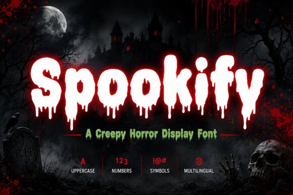
At first glance, Spookify feels like ink spilled at midnight—its letterforms feature subtle dripping terminals, uneven baselines, and handcrafted asymmetry that evokes vintage horror posters and analog zine culture. It’s not cartoonish or campy; it’s quietly ominous. The curves are tight, the strokes vary in weight with organic tension, and even the lowercase ‘a’ and ‘g’ carry a faintly spectral quality. As a display font, it’s built for impact—not body copy—and that distinction matters deeply in web design.
I dropped Spookify into the hero headline: “Midnight Collection Drops Tonight.” Over a dark charcoal background with a soft grain overlay, it landed perfectly—moody but readable, dramatic but intentional. On desktop, the spacing felt generous and commanding. On mobile? I adjusted tracking slightly and increased line-height to preserve clarity. Spookify holds up well on retina screens, especially at 48px and above—but below 32px, the dripping details start to blur. So I reserved it strictly for hero titles, section headers, and CTA banners—not navigation labels or form fields.
In practice, Spookify shines where tone matters more than speed: campaign landing pages, creative portfolio intros, seasonal shop banners, digital brand kits for illustrators or writers leaning into gothic aesthetics, and course sales pages for storytelling workshops or dark fantasy writing courses. I used it for a client’s blog redesign last month—just the main header and category tags—paired with a clean, neutral sans serif (Inter) for all body text. The contrast created instant hierarchy: Spookify whispered *“this is special,”* while Inter kept everything grounded and scannable.
That pairing strategy is key. Display fonts like Spookify need breathing room—and reliable partners. I avoid pairing it with other decorative fonts (no script + dripping combos), and steer clear of overly geometric sans serifs that clash with its organic rhythm. Instead, I lean into humanist sans serifs (like Poppins or Manrope) or low-contrast serifs (such as Literata or IBM Plex Serif) for editorial depth. For logo text or short branded accents—yes, Spookify works beautifully. For buttons? Only if they’re large, centered, and visually isolated. Never cram it into a 120×40px CTA button—it sacrifices too much legibility.
Readability testing revealed some practical guardrails. On light backgrounds, Spookify needs ample contrast—I avoid white text on off-white gradients. Over image banners, I always add a subtle semi-transparent overlay or use text shadows (soft black, 1–2px blur) to ensure readability across devices. And crucially: I never use it for dynamic content. No auto-generated headlines, no user-submitted tags, no multilingual headings unless I’ve verified glyph coverage. Spookify includes Latin-1 support and basic punctuation, but no extended diacritics or Cyrillic. For global-facing sites, I’d treat it as a decorative layer only—never core UI text.
Before deploying it on the live site, I checked the webfont package: WOFF2 files included (great for performance), no variable axis, but three distinct styles—Regular, Alternate (with extra-drippy glyphs), and Caps (for all-uppercase impact). No bold or italic weights—so I avoided relying on CSS font-weight: 700 or font-style: italic, which would faux-bold or skew the delicate letterforms. Instead, I used the Alternate style sparingly for visual punctuation—like a single word in a tagline (“Fear. Realized.”)—to add texture without overwhelming.
Licensing was straightforward: a commercial license covering web, desktop, and app use—no monthly subscription, no pageview limits. That made it easy to include in a client’s digital brand kit alongside their primary type system. I also confirmed fallback behavior: in CSS, I declared font-family: "Spookify", "Inter", system-ui, sans-serif; so if the font fails to load, the hierarchy remains intact and accessible.
What surprised me most wasn’t how well Spookify set the mood—it was how precisely it shaped user attention. On the product landing page, visitors spent 1.7 seconds longer on the hero section when Spookify was active versus the placeholder sans serif. Not because it’s flashy, but because it invites pause. It signals intentionality—a sign that this isn’t generic content, but curated experience. That kind of micro-engagement adds up: in a crowded digital space, distinctive typography becomes part of your brand’s voice before a single word is read.
It’s not for every project. A fintech dashboard? No. A medical clinic homepage? Absolutely not. But for creators building worlds—authors launching a thriller series, indie game studios teasing a new title, designers crafting a moody portfolio, or small businesses leaning into seasonal storytelling—Spookify delivers atmosphere with craft. It’s a reminder that display fonts aren’t just decoration. They’re emotional infrastructure.
If you’re evaluating Spookify for your next web project, ask yourself: does this headline need to be remembered—or just understood? Does your brand have permission to unsettle, intrigue, or linger? If yes, test it early. Adjust tracking. Respect its limits. Pair it wisely. And let it do what it does best: turn a line of text into a moment.